

Flagship demo case study. Atlas Freight is a fictional company built to demonstrate my full process end to end. Every artifact is real work; the client and the numbers are illustrative, not client data. This is also the canonical template every future (real) case study will follow.
Executive summary
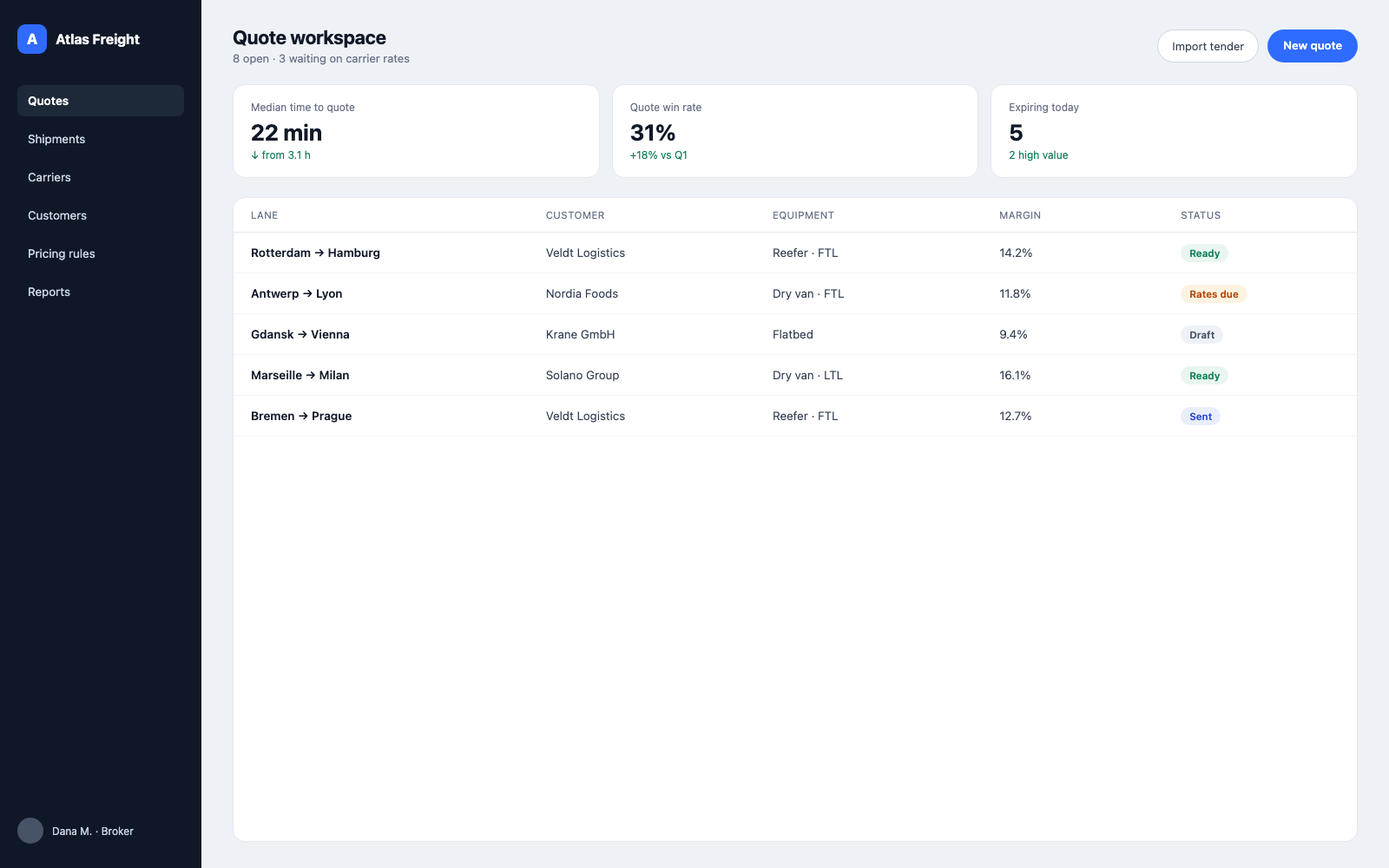
Atlas Freight is a quoting platform for mid-market freight brokerages in Europe. Brokers were losing business not on price but on speed: building a single quote meant juggling email, spreadsheets, and three internal systems, and customers often booked with whoever answered first.
Over 14 weeks I led design end to end, from field research through a tested, dev-ready workspace. The redesign collapsed quoting into one flow with live carrier rates and a margin guard.
- Median time to quote (was 3.1 h)
- 22 min
- Quote win rate
- +18%
- Task success (was 58%)
- 92%
- SUS score (was 54)
- 81
Business context
Atlas sells to brokerage desks of 5 to 50 brokers. Revenue follows seats, and seats follow whether brokers actually live in the product. Telemetry told a blunt story: brokers opened Atlas to log finished quotes, but built them elsewhere. The product was a system of record when the business needed it to be a system of work.
Leadership's goal for the engagement: make Atlas the place where the quote happens, and prove it with quote turnaround time and win rate.
Problem statement
Brokers lose winnable business because assembling one quote takes hours across five disconnected tools, while the customer's window for an answer is measured in minutes.
Two constraints shaped everything: brokers would not give up speed for "correctness" features, and ops managers needed margin discipline without slowing brokers down. The design had to serve both or it would serve neither.
Discovery
I spent the first three weeks in the work, not in the backlog:
- 14 broker interviews across 6 brokerages in the Netherlands, Germany, and Poland.
- Contextual inquiry: full mornings shadowing 5 brokers at their desks, recording every tool switch during live quoting.
- Systems audit of the current quote path: 5 tools, 11 screens, 23 manual copy-paste steps for one typical FTL quote.
- Win/loss data pull with the sales team: 6 months of outcomes, joined against response time.
The decisive finding came from the data join: quotes answered within one hour won at nearly three times the rate of quotes answered the same day. Speed was not a preference. It was the market.
Research insights
Coding the interviews surfaced five recurring patterns; four drove the design directly:
- The first reply usually wins. Customers tender to 3 or 4 brokerages at once and most book the first credible answer. Every minute of quote assembly is leaking revenue.
- Retyping is the real tax. Brokers re-entered the same lane, cargo, and customer data in up to four places. Errors from retyping caused the most embarrassing failures (wrong equipment quoted, stale fuel surcharge).
- Rates go stale silently. Carrier rates arrived by phone and email, got pasted into spreadsheets, and aged invisibly. Brokers quoted on rates they no longer trusted.
- Margin is checked too late. Ops reviewed margins after quotes went out. Coaching happened weeks later, if ever.
- Losses teach nothing. No one recorded why a quote lost, so pricing intuition never compounded across the desk.
Personas
Two personas carried every prioritization call. Both were built from the interview coding, not from demographics.
Dana is the primary persona; the product wins or dies at her desk. Viktor is the economic buyer. The tension between them (speed versus discipline) is the core design problem, so I kept it explicit instead of averaging it away.
Journey mapping
The current-state map (above, in research insights) located the two deepest pain valleys: chasing carrier rates and the silence after sending. The future-state map made one structural bet: the quote is the workspace. Rates, margin, customer view, and outcome all attach to the quote object instead of living in separate tools. Every later IA and screen decision traces back to that bet.
Information architecture
A 24-participant card sort (brokers and ops, mixed) reshaped the navigation:
- "Rates" split out of the builder with 87% agreement; brokers think of rate-gathering as its own activity with its own urgency.
- "Outcomes" emerged as a first-class area. Nobody had a home for win/loss before, which is exactly why it never happened.
- The pipeline organizes by urgency, not status. Brokers triage by "what expires next", so the default sort follows the clock.
Design decisions
Four decisions defined the product. Each one traded something away on purpose:
- One screen per quote, no wizard. A wizard tested cleaner with new users but slower with everyone else, and Dana's desk lives on speed. New-user guidance moved into inline defaults instead of steps.
- The margin guard is a rumble strip, not a gate. Quotes below the desk's margin floor get a visible warning and notify Viktor, but they still send. Blocking would push brokers back to spreadsheets within a week.
- Rate freshness is always visible. Every rate carries its age ("2h old", "yesterday"). Stale data was a silent killer, so staleness became a loud, glanceable property.
- Losing a quote costs one click. The loss-reason prompt is a single tap from the pipeline. Anything heavier and the outcome log would stay empty, killing the learning loop that justifies it.
Wireframes
Lo-fi first, tested before any visual investment. Three frames carried the core flow:
Round one (n=8, task-based) killed two ideas early: a Kanban pipeline (brokers read lists, not boards, when triaging by time) and an auto-pricing suggestion that brokers distrusted enough to re-check by hand, making it slower than no suggestion at all.
Visual design
The visual layer stayed deliberately quiet: a near-black chrome, one blue for primary actions, and status colors that never appear without a text label. Brokers work in this screen for hours under interruption, so contrast went to the data, not the furniture. Money and margins render in tabular numerals so columns scan vertically at speed.
Design system
The engagement shipped a core slice of a design system, not a poster: tokens, the status-chip family, table primitives, and the quote-line row that almost every screen reuses. Two rules earn a mention because they came from research, not aesthetics: status is never communicated by color alone (two of the 14 interviewed brokers were colorblind), and every monetary value uses tabular numerals.
Prototype
Validation ran on a high-fidelity Figma prototype covering the full happy path (tender lands, quote built, rates attached, sent, outcome logged) plus the two failure paths that mattered: a below-floor margin and an expired rate. The margin-guard interaction went through four rounds; the first three either nagged too much or hid too well. The shipped version interrupts exactly once, inline, at the moment of send.
Validation and testing
Two structured rounds against the same five tasks, separated by a major revision:
- Task success, round 1 to round 2
- 58% → 92%
- Time on core task
- -42%
- SUS, legacy vs redesign
- 54 → 81
- Brokers in final round
- 10
The round-two protocol used real tenders from each participant's own inbox instead of scripted scenarios. Numbers from your own work are harder to flatter, and two of the remaining failures only surfaced because real data is messier than test data (a multi-currency lane and a customer with two delivery addresses).
Outcome
Ninety days after rollout to the first three desks:
- Median quote turnaround fell from 3.1 hours to 22 minutes.
- Quote win rate rose 18% quarter over quarter on comparable lanes.
- 96% of quotes now carry a logged outcome, up from roughly zero; desks run quarterly pricing reviews on data that did not exist before.
- Below-floor quotes dropped by half with zero hard blocks, the trade the rumble-strip decision was betting on.
The sharper proof: brokers stopped exporting to spreadsheets. The product became the place where the quote happens, which was the actual brief.
Lessons learned
- Join the data before trusting the interviews. Brokers said price lost them business; the win/loss join said speed. Both felt true at the desk, only one was.
- Discipline features must be free for the disciplined. The margin guard works because it costs a compliant broker nothing. Designing the warning for the 5% case without taxing the 95% case took more iterations than any screen.
- Test with the user's own data sooner. Real tenders exposed failures that four rounds of scripted prototypes never would have. Next time that happens in round one.
- A one-click log beats a perfect form. The outcome data that now drives quarterly pricing reviews exists only because logging a loss costs a single tap.
